I've had to use Microsoft operating systems on and off (mostly off) since the late 1980's. Yeah, yeah, I know. Like any normal person my response to the early exposure has been to try to limit later exposure -- to avoid employment options that obliged me to use various Microsoft products on a daily basis. I recently failed on this front quite savagely. I now suffer frequent doses of MS Windows 7, 8, 8.1, as well as the usual crufty products that go hand in hand with these things -- Microsoft Office, proprietary add-ons, OneDrive, Sharepoint, OneDrive for Business (which is neither one nor the other), and various other server-side abominations.
It's been educational, but not in a good way. More like the way that being diagnosed with something decidedly unpleasant forces you to quickly become an expert in unpleasantness.
I am shocked and depressed to experience part-time what MS Windows users have to put up with all the time, even with these ostensibly modern and popular iterations of the platform.
What follows is a minor litany of woes ... undeniably exhausting, but by no means exhaustive.
Note that I'm normally using KDE on top of Debian GNU/Linux. Some of my comparisons are specific to this combination and may not apply equally to other free desktop environments.
Though they probably do.
Tiny, non-resizable dialogs
One of my machines has a ludicrously high resolution display. But even on average displays, default dialog sizing on Microsoft Windows is frustrating.
The frequent use case is to be presented with a teeny tiny dialog, with a bunch of options contained within, and blocking any other activity on the desktop until you attend to it.
And you are not allowed to resize the damned thing.
On KDE it's extremely rare to stumble across a dialog or child window that you can't resize. If such a dialog does pop up, it's typically configured that way intentionally and thoughtfully, as there are risks and/or no benefit to resizing.
On Microsoft Windows there's an abundance of examples of this totes shitty behaviour.
For instance:
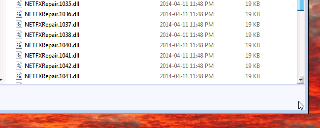
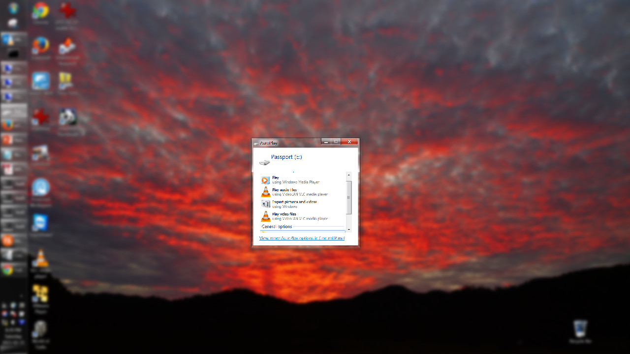 Teeny tiny dialog for Autoplay (on USB drive connection)
The specific contents are not hugely relevant -- in this case it's the autoplay option chooser when plugging in a USB drive. Note that the dialog is using a tiny amount of the screen, is not resizable, and has a scrollbar only because the contents are about 10 pixels bigger than the fixed dialog.
As a bonus, when you shange the dialog size in KDE it'll typically remember the new geometry every time that same type of dialog is generated.
No remembering of save-as and other dialogs
KDE has directory path shortcuts (Favourites, in the MS Windows vernacular) that you can elect to see in various file-operation dialogs.
In KDE you can have these shortcuts appear only in dialogs of particular applications (even though it may be the same dialog - say a 'Save as...'). This makes a shedload of sense.
For example you neither want or need to see the 'My Music' favourite when you're about to save something from GIMP, right? MS Windows isn't this smart, of course.
Worse, it doesn't even remember the size of things like the save-as dialog box from one call to the next. Or the most recent (file system) location that you did a save-as to -- both of which are of course the default behaviour on KDE.
This means every time you save-as from any application in Microsoft Windows you have to live with the wrong-sized dialog, or resize it each and every time. And you typically do want to resize it because your file system view is crufted up with myriad directories which are totally irrelevant to what you're trying to do with that particular application at that particular time.
File manager insisting on changing your view
Within File Explorer you can change your default view, and then (via the Tools menu) apply it to all folders past and present. You might choose to do this because you prefer to see the Details view, perhaps because you hate over-sized information-light icons that obscure half the file name.
You may tell it, within that customised view, to not show the rather pointless 'File Type' column, because you can work that out yourself (and because you've quite sensibly told it to not hide filename suffixes, just like a grown-up computer user). You may, basically, be happy with the file name, the date stamp and the file size.
But then you enter another directory and you see the 'File Type' column is back, pushing the information you care about off to the right (you'll need to scroll horizontally in the explorer window to see it). Evidently Windows knows better than you do about what information you need to see about your files, even after you explain carefully that it does not.
Even more frustrating, navigate to a directory full of audio or video files, and you get dropped back to a horrendous Icons view, because your computer believes you miss the early 1980's - notably geos
Blocking dialog windows
Especially bad when you're four modal dialogs deep and just want to move at least one of them out of the way.
It's especially bad on Microsoft Windows, as you frequently get hit with dialogs that you can't copy text out of - even though it's clearly text being displayed, you can't select anything in there.
Consequently you have to open up a browser and start to type in the error information ... but that's when you get hit by the challenge of being unable to move dialogs around if they're blocked by parent or child dialogs. And, usually, the g-g-g-parent of the worst of these dialogs is taking up most of your screen, so you can't get your new browser window and the error message on screen at the same time, either. Truly brain-dead.
Blocking file system
Comparably frustrating - though it's hard to really say which is worse - is the fact that the file system blocks operations if you've got pending operations waiting on, say, user input.
For example, you can't rename a directory if you've got a file from that directory open.
GNU/Linux (and all other *nix (and indeed all other sensible)) systems use the file system's inode to identify directories -- so you can happily rename them. The file stays open, can be saved safely, etc.... once you get used to the idea of making changes to your file system without having to hunt down and close whatever application you happen to have open that is using a file in some random directory ... it's hard to go back to this kind of blocking activity. Especially when the problem relates to a network file system you have no control over, or some Explorer window that's got a sub-directory 'open' (even though no files are actually locked).
Select-all automatically enabled on some text entry fields
It's the some that really blows, though the fact it's on any at all is more than sufficiently sucky.
The automatic select-all anti-feature is most noticeable on the address bars of many browsers.
Annoyingly this feature was ported over to the GNU/Linux versions of Chrome and Chromium about 15 months ago, and despite lots of requests that it not be enabled, or at the very least that there is a setting to control this, the discerning amongst us were pretty much told to go fuck ourselves.
More a Google / Chrome problem there, but the fact remains that Windows users think this is normal and acceptable. I guess it's because they don't have a concept of using left-mouse-button to select and middle-mouse-button to paste. Or, they're not usually so sophisticated that they would ever want to edit a URL, instead wanting to overwrite all the time (again, without left/middle mouse for copy/paste, this is even more cruel).
Snapping back your scrolled browser window
Another annoying immigrant that's hit Chrome and Chromium users on GNU/Linux, is this apparent default configuration for MS Windows, where if you drag a scrollbar, and move the mouse some certain distance away from the scroll bar area, it assumes you didn't really want to scroll.
Here's some demonstrations on Chromium and Windows Explorer - note that in each case the drag (left-mouse-button) hasn't been released at any stage - it's the snap-back bollocks that causes display contents to change, based on mouse location:
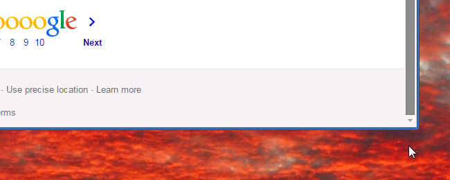 Windows 7, Chromium - scrolling, mouse within snap-back range
 Windows 7, Chromium - scrolling, mouse outside of snap-back range
As you can see above, the snap-back threshold is about 1cm below the outside of the window -- and with a similar distance from the left and right sides of the scroll bar.
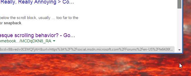
With Windows Explorer, as shown in the next two screen shots, when using Explorer's (default) status bar feature, the snap-back threshold actually exists within the application window:
 Windows 7, Explorer - scrolling, mouse within snap-back range
 Windows 7, Explorer - scrolling, mouse outside of snap-back range
Some brief research on the interwebs suggests that: a) this annoys lots of other people, b) there's no way to disable the snap-back feature in Microsoft Windows, c) Chrome developers think GNU/Linux users that started experiencing (and hating) this feature in mid-2014 can suck it up (ie. they refuse to make it an option within the Chrome codebase, despite it being orthogonal to the way that every other Window Manager available under GNU/Linux behaves), and d) it's actually calculated based on the number of pixels that you're away from the scroll bar area.
So, the above screen shots are frustrating enough on my virtual 1921 x 1131 display (taking up most of a 27" screen).
But on my 15" laptop screen at a crazy 3200 x 1800 resolution, the effect of this anti-feature is simply brutal.
The fundamental problem of course is that an assumption has been made. Doubtless there are some use cases where, and some people sufficiently indoctrinated by now to believe that, it's an appropriate behaviour.
However if you don't find it convenient your only option is to go fuck yourself.
Personally I find it an unpleasant default. On large displays, on displays with very high DPI, and in use cases where I do not have applications vertically maximised, I find it extremely frustrating.
And even with vertically maximised applications -- as shown above, with Chrome I can probably get the get mouse to the screen-edge without suffering the snap-back. But with Explorer I simply can't. So we've now got a complicating problem of inconsistency -- in turn this requires that you think carefully about all your movements. Which is just tiring. But somewhat typical of how you have to use Microsoft Windows and applications within same.
This problem actually first affected me about a year ago when it was introduced slyly into real desktop environments. As alluded above, the Chromium developers introduced it around v35, generating many bug reports and forum posts asking them, basically, to provide an option to disable the feature.
For reference, the two bugs were chrome-bug-337919 (2014-01), requesting that this broken behaviour be implemented on MS Windows platforms, and chrome-bug-377191 (2014-05) requesting that the unwanted change be reverted on non-Microsoft platforms.
If you read some of the developer comments in those two bug reports you will be unpleasantly underwhelmed by their focus on being smug, rude, and illogical, rather than considerate, helpful, and inclusive.
General window management limitations
In Windows 7 you can double-click on the very edge of a window's top or bottom border to maximise vertically.
You can go fuck yourself if you think that'll work on the left and right borders to maximise horizontally.
You can also go fuck yourself if you would like to configure the window manager to let you double click on the title bar to maximise vertically, rather than have to pixel-peep to get the border edge. (Again a tricky procedure on a high resolution display, or indeed when using a laptop's trackpad.)
The minimise / maximise / close triplet of buttons on the far-right of the title bar for a window do precisely, and no more, than what they look like they'll do.
In contrast, on KDE I can:
- configure double-click on title bar to maximise, maximise veritically, maximise horizontally, shade, lower, close, push to all virtual desktops, or do nothing
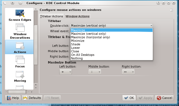 KDE title-bar double-click options
- mouse-scroll (or wheel event as they call it) to switch windows, change opacity, toggle 'keep above', and so on
- configure left, middle, and right buttons to do these things and more, and also have different settings depending if the window has focus (is in the foreground) or does not
- it comes up elsewhere - but middle-click on title bar to push a window to the background is insanely beautiful, and once you've used this it's a real pain to work with systems that don't support the feature
- configure the maximise button to do different things depending which mouse-button I use - so left is maximise full screen, middle is maximise vertically, and right is maximise horizontally (by default - and of course, these are adjustable)
Having to click in a window to focus it
This is just whacky.
I can see the (non-focussed) windows there on-screen, and I know I want to click a radio button, or select a text-entry box, or press the Next button, or whatever.
But that doesn't work. Instead I am obliged to click in the window somewhere to get focus, and then click again to do the thing that I actually wanted to do in the first place.
More to the point, and again coming back to hobgoblins, there appears to not be full consistency with this -- occasionally you can click in a non-focussed window to obtain focus, and it actually responds to whatever element in that non-focussed window you happened to click on.
I do need to research this some more, but at the moment it's firmly in the 'This behaviour is savagely broken and frustrating', with an element of 'Oh fuck, and it also isn't consistently broken' -- consequently it's in the 'even more frustrating' category.
Oh, and yes I know there's the "Ease of Access" feature buried in Control Panel that toggles an automatic focus facility on mouse-over.
Unfortunately it's not really a facsimile of the feature (and in practice focus-follows-mouse is an unpleasant configuration on any desktop).
Scrolling in a window you can see, but isn't in focus
Vaguely related to the previous point, but the problem is that you can't scroll in windows that aren't in focus (and therefore on top of all other windows).
It's not clear why this isn't allowed, or how it's useful (given things like the horrendous snap-back feature discussed above that constrains scroll bar regions to with 125 pixels of the scrollbar) to be able to scroll a window while you're nowhere near it.
Once you get used to the way things can be, as provided by pretty much any Debian/GNU desktop environment, it's hard to let it go and settle with the Microsoft way of (not) doing things..
On MS Windows there's at least one third party tool that I've found that let's me do this -- and it mostly works. Taekwindow is its name.
It also provides the comparably useful action of being able to push a window to the background by middle-mouse-button clicking the title bar. (Again, a hard feature to let go of when moving from, say, KDE, to Windows.)
Curiously, after installing Taekwindow another problem was highlighted. With this utility installed I can middle-mouse-button on the title bar to push most applications to the background. However, it doesn't work on all applications. Notably recent Microsoft Office 2013 applications don't work with this. I've spoken with the developer of Taekwindow, who confirmed he was seeing the same problem, but evidently it's going to be a non-trivial problem to investigate and resolve.
The main point here is that Microsoft has made some special (in the Special School Mini-bus sense of special) changes to the way some windows are rendered and managed. The idea that there are special application windows is basically a breakage to your DE. That all these special windows are sold to you by Microsoft ... well, make of that what you will.
Office 2013 (and 2016) really is special
Not special as in lovely. Special as in special school, special child, special needs, etc.
Related to one of the en passant observations above, the border on Office 2013 applications is TINY. On a high resolution monitor this becomes especially painful, even if you've done the DPI / custom zoom of 150% or 175%.
You can customise the size of the borders on all windows in KDE -- and it's respected across all windows, as you'd expect. Because, you know, all windows will include all windows.
In KDE you go to the relatively intuitive: System Settings --> Workspace Appearance --> Window Decorations --> Configure Decorations --> Border Size. And then you can select from these options:
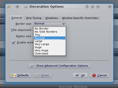 Available options for KDE window border sizes
On Microsoft Windows 7 you navigate to: Control Panel --> Personalisation --> Window Colour --> Item: Border Padding --> Size and then pick a number from 0 to 100. (Presumably not pixels, but it's not clear what it actually is.)
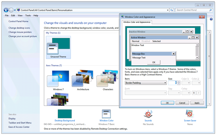 Available options for Windows 7 border sizes
Apart from being very well hidden (border size as a subset of window colour -- WTF?!), it's also blissfully ignored by every Office 2013 & 2016 application. (Fuck you very much.)
This is especially frustrating as Office applications are a) what you tend to have at least one of open most of the time, b) usually vertically maximised and against a left or right border, and c) the default borders on Office applications are tiny -- as far as I can tell about 2 or 3 pixels. Even with my rinky dinky 1600DPI, extra-weighted, ultra-accurate gaming mouse, it's a difficult process to try to grab the borders on these fuckers.
One of the other consequences of tiny / non-existent borders of applications like, say, Word or Excel -- when they're maximised, or even just up against the far-right side of the screen, you can't bring them to the front without hitting the scrollbar, and consequently moving your location within the document.
Undeniably a brain-dead design.
Virtual desktops
I believe Microsoft is intending to introduce this feature in Windows 10.
Well done chaps. I've been using virtual desktops since 1998.
The absence of them (once you start to use them) would be similar to the absence of tabs in your browser.
(For younger readers, web browsers didn't always have tabs - originally you'd have a new window per URL. This was normal for many years. Try to imagine using the web now without tabs. Go on. Try.)
Anyway, the fact that MS hasn't put this feature in until now^H^H^Hsoon suggests there's some technological challenges (or fundamental architecture / design problems in oldspeak), which isn't too much of a surprise. On the other hand, plenty of other people have come up with their own third party tools that, up to a point, provide a workable implementation of the feature on Windows.
As one example, I use a thing called dexpot.
It's non-free, so I can't fix the brokenness of it, and it suffers from plenty of weirdnesses and inconsistencies, as well as performance problems that simply shouldn't be seen on (say) a 16GB i7 with a high-end nVidia GPU.
For the record, challenges with it include:
- applications sometimes appear on multiple (but not all) desktops,
- minimal options regarding mini-maps on the system tray,
- redrawing a desktop can be slow and generally screws up the alt-tab stack order,
- does not remember which applications were on which virtual desktops from one login to the next,
- presenting windows on a desktop is rarely consistent, or indeed logical.
On KDE I have 6 virtual desktops, and, occasional problems notwithstanding, when I log out and in again the various applications that I was running are loaded back up, and put onto their appropriate virtual desktop. This includes web browsers, file managers, terminals, word processes and spreadsheets, music players, and so on.
Perversely I rarely log out of KDE. Whereas Microsoft Windows still crashes / forces unwanted driver upgrades / does weird shit that demands a reboot much more often ... so the lack of its ability to get me back to where I was has a much bigger usability impact on that platform.
Alt-tab / window history inconsistencies
I think they inherited this from the OSX crowd, where people actually pay good money for an operating system where you have to think about whether the three windows you're playing with are the same or different applications, and depending on which, you then have to use a different modifier + the tab key to flip between them. Totally broken if you have a workflow like the one I'm using right now - two konsole (terminals) and one chrome. On KDE I just alt-tab once or twice, depending on which I used most recently (and therefore which appears above the other on the display).
On OSX it's far less comfortable -- I have to alt-tab if it's a different application (say, terminal to browser), but cmd-tab if it's the same application (say one terminal to another terminal).
On MS Windows -- spectacularly -- it's even whackier.
If you have a couple of MS Word documents open, but way down the stack's history, and then use File Explorer to open a new Word document, realise it's not what you were looking for and therefore either close it or alt-tab to go back to the File Explorer ... you'll find that your most recent app (as far as alt-tab is concerned) is not File Explorer, but some other Word document that you last looked at some hours earlier.
Because fuck you.
If you haven't found the document you're looking for, perhaps you'd like to look at a completely different one, rather than the tool you'd use (and in fact were using just a few seconds ago) to find the right document.
I can't imagine any use case where opening a particular file, then closing the application, would mean that I want to see other files open by that application.
Hiding user accounts (cyg_server)
User accounts on GNU/Linux are created frequently, with the intent of isolating daemons and services with the constraints of a severely privileged user.
On MS Windows this isn't the default approach, which is one reason the entire system is less secure (by design). And when you do start to add users, as CygWin / babun does, you then get it thrown up on the GUI login page.
When using KDM (and most other display managers) you don't see accounts with a UID less than 1000 -- for they are the system and special purpose accounts. If you want to hide other 'normal' users, you pop into System Settings | Login Screen | Users - and select the users you do, or do not, wish to have a presence on the login screen. Job done. Move along now.
On Microsoft Windows there's no comparable way to do this, even via Computer Management (users are not part of the computer unless you have a very non-network view of the world), and into the Local Users and Groups | Users section.
Instead, the following appears (according to google) to be the most 'popular' way of obtaining this result:
This is taken from:
The source is interesting in that it's tremendously well hidden.
Anyway ... all you must do to obtain a similar result:
- Start | Run
- Run regedit.exe (as administrator)
- Navigate to: HKEY_LOCAL_MACHINE\Software\Microsoft\WindowsNT\CurrentVersion\Winlogon
- In the left panel, right click on Winlogon , New | Key
- Use the name SpecialAccounts and press Enter
- In the left panel, right click on SpecialAccounts, New | Key
- User the name UserList and press Enter
- In right panel of UserList, right click on a empty area -- New | DWORD (32bit) value
- Type in the name of the user account that you want to hide -- in my case cyg_server
- In the right panel, right click on cyg_server and select Modify
- Confirm or change the value to 0 (zero), then click OK
I shit thee nay.
The author of that guide helpfully informs the reader that re-enabling login to that account merely requires going through the same steps but changing the value to a 1.
One assumes that the author is taking the piss. Or has simply never worked with proper operating systems.
Forced updates (turned on by default)
And a horrible interface for querying just what's about to come down (lots of forward and back clicking).
Constant reminders if you set this to anything other than the default 'chew up all my bandwidth whenever you like, and reboot without warning'.
Sun Java horrendousness
Okay, not Microsoft specifically, but something that we're protected from over here on the GNU/Linux world.
Every few days (it seems) you get hit with this little fucker:
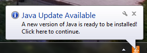 Do you want to play a game?
And then when you do ...
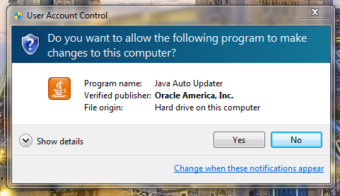 Every time you pay attention to the blinking system tray fucker
It demands that you let it make all kinds of impossible-to-track changes to your computer.
These unwanted changes include this horrendously annoying anti-offer:
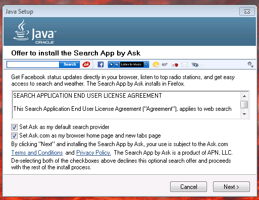 Oracle Java insisting that you use Ask.com as your search provider. The cunts.
Factory re-install disk
This is a Dell manifestation of the problem, but I've seen it on every laptop I've owned that's had MS Windows installed on it...
Non-resizable location / search address bar in Explorer
No idea what's going on here - I get the <-> tooltip when hovering over the taint between Location and Search, but nonetheless I can't resize it. I'm stuck with a Search bar (which I rarely use anyway) that's 5 times longer than the Location (which I rely upon being able to see).
It also looks like it keeps reverting that to Breadcrumb Mode, rather than the (at least twice I've configured this now) Path Mode.
Breadcrumbs rather than paths in the file manager
Breadcrumbs in Windows Explorer are basically non-optioned ways of hiding the path that you're working in, providing you (in turn) with more screen real estate used to provide more information that you will find useful, and making it harder to navigate around your file system.
Some people like them. Those people are (probably) dickheads.
Anyway, there's no feature to disable them on Microsoft platforms. If you're used to an operating system that doesn't try to make your job harder by hiding powerful and simple representations of the file system in the various GUI file managers, then it's a right pain.
There's a fix for Win7 called Bread Crumb Killer, by twig, that solves this problem.
File system path depths
NTFS is pretty creaky, with lots of minor annoyances including the fact you occasionally need to defragment the MFT as well as the file system proper, that you can't use colons in file names, that extensions are still the primary way of identifying file (types), and so on.
However the thing that bites me most frequently is inconsistent way that this limitation will bite you.
For example, I keep a synchronised copy (using unison which in turn uses rsync between a couple of my machines, and a company file server managed by people other than me. On the file server our team has been allocated a sub-directory with a ridiculously long path -- this is mostly hidden from us, as users, as we tend to map a drive letter into the appropriate location. But the impact is this -- when creating directory and file names locally, I'm immediately alerted when I hit the arbitrary length (it's roughly 256 characters), but I get hit again when I do a synchronisation to the server and the total length of the valid path on my local file system, when combined with the path on the server, exceeds the limit.
(Aside -- I know that it's technically 260, but that's due to MAX_PATH rather than an NTFS constraint per se -- NTFS ostensibly will handle up to 32,768 characters in a full path name, it's just that Microsoft has never released an OS that uses this feature. Go figure.)
For bonus points ... Microsoft Office
Microsoft Word confused about EOL
This is mostly out of the box configuration - there seems to be ways to adjust some of the smart selection (smart selection is turned off as soon as I start a new application -- and of course selection configuration options are different in every in every flippin' application, rarely in the same menu location, etc). But out-of-the-box behaviour shouldn't be so broken. And consistency would be lovely.
Try to grab a screen partial video of these.
In Word - pick a line with more than 0 characters on it.
Home - shift + End (select line) - DEL --> deletes entire line AND line feed, moving next line up one
End - shift + Home (select line) - DEL -- deletes entire line but NOT line feed, so next line stays where it is.
Similarly - navigating to the end of line takes you to just after the last character. Navigating to the start of the line takes you to just before the first character.
BUT ... shift+end takes you to two characters after the end of the last character, so if you're wanting to delete from where you are to the end of the sentence, but keep the full stop, you have to shift+end+cursorleft+cursorleft. If you want to delete to the start of the line but keep the first character it's shift+home+cursorright.
It bites even more in tables - if there's two lines in a table's cell, and you select to the end of the first line, you select to the end of the first line. If you select to the end of the second line, you select the whole cell, and have to cursor-left while finishing your selection in order to deselect the entire cell.
Fucking consistency ...
Middle click on a link in MS Word and it gives you a little round icon and you can move the content up and down without using scroll (ie. the button that 99% of people would have just proven they had on their mouse).
Right click gives you copy (greyed out unless you've selected the URL manually) and 'Select Hyperlink, Open Hyperlink, Copy Hyperlink, and Whois'.
Tidying up Outlook messages ..
You can't delete embedded images - and since most places heavily constrain your mail box, this can really bite when people embed diagrams, photos, overly heavy signatures (the last is very common amongst the kinds of people who like to macdink their Outlook signatures) ... and your only option is to delete the entire message.
With properly attached attachments you have the option to save the attachment, then remove it, making the message nice and small again - though it does mean you end up having to manage an email archival structure in parallel with a document archival structure.
Microsoft has many recommendations on ways to alleviate this problem - but since
a) they are the engineers of the problem, and
b) the solutions they suggest involve further lock-in to yet more Microsoft products, and
c) they rarely work very nicely anyway
... then it's all a bit disingenuous.
Being able to right-click and remove embedded objects -- just like you can with every other product in their Office suite -- would be a fantastic start (and end) to this problem.
Microsoft Excel
If you want to edit a cell, you have to use the mouse. There's no way that I can find (and trust me, I've looked) to edit cells entirely from the keyboard. This makes navigation painfully slow, and somewhat counter-intuitive.
Libreoffice will happily let you configure 'enter' to be 'edit current cell', which makes perfect sense. Why have (as Excel does) enter as a synonym for cursor-down. Unless you're trying to make your spreadsheet more vim-like.
Addenda that I'm just too pissed off to wrap up
Upgrades
@TODO Insert image from nexus5 2015-04-25 T 19:00 - showing 'reverting changes'. Took about 8 minutes, and two reboots.
This was subsequent to an upgrade that was attempted online - when the machine shutdown (to restart) I kept it shutdown, then booted up at a place that I didn't have network ... very frustrating that the installation and system configuration part of the upgrade process require network connectivity, even after all components are (ostensibly) downloaded.
@TODO Notes from an especially frustrated Jedd one time:
resolution of excel cells... paste, Mark, Shortcuts shown, counter intuitive, paste in excel requires mouse, home and cursor keys different across on paste and edit (looks the same though)
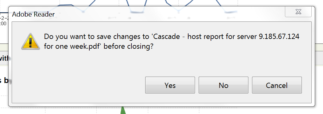 Adobe Reader thinks it can get some Write action
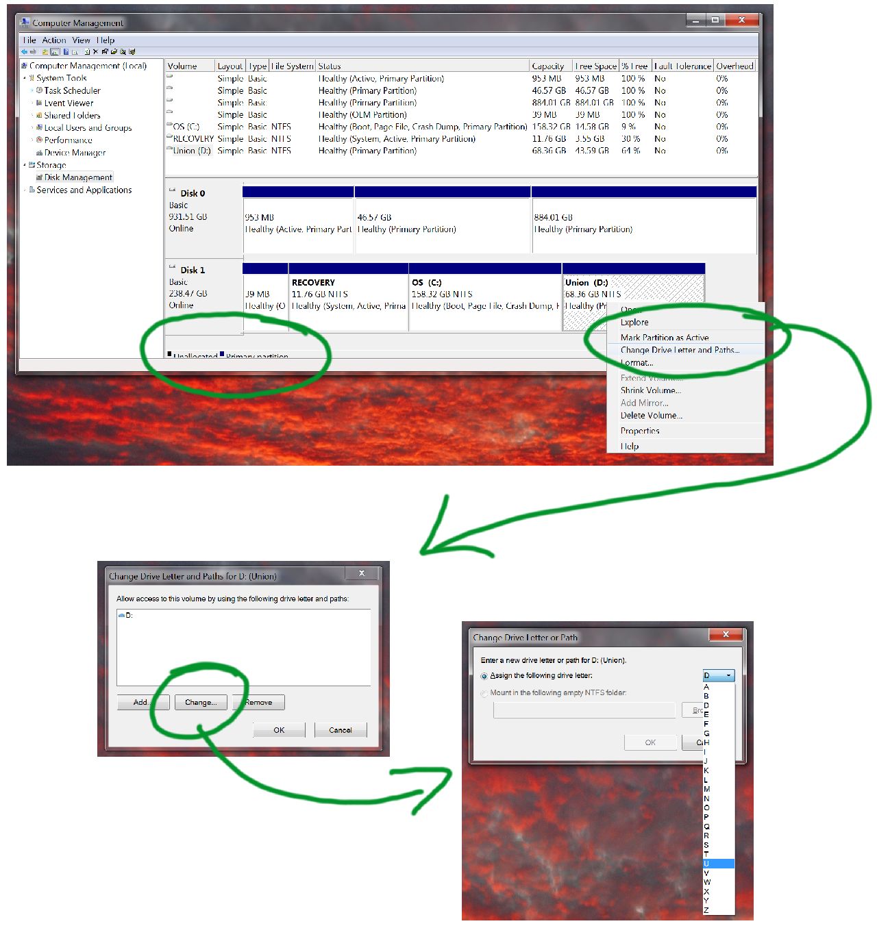 The seamless process of changing a drive letter on Windows
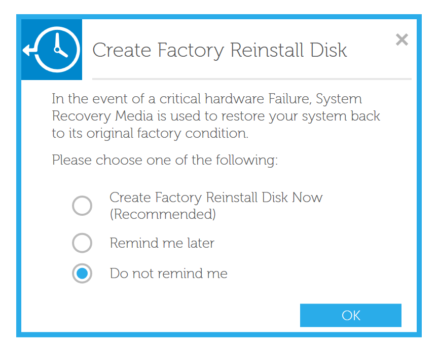 Dell's do you want to dance
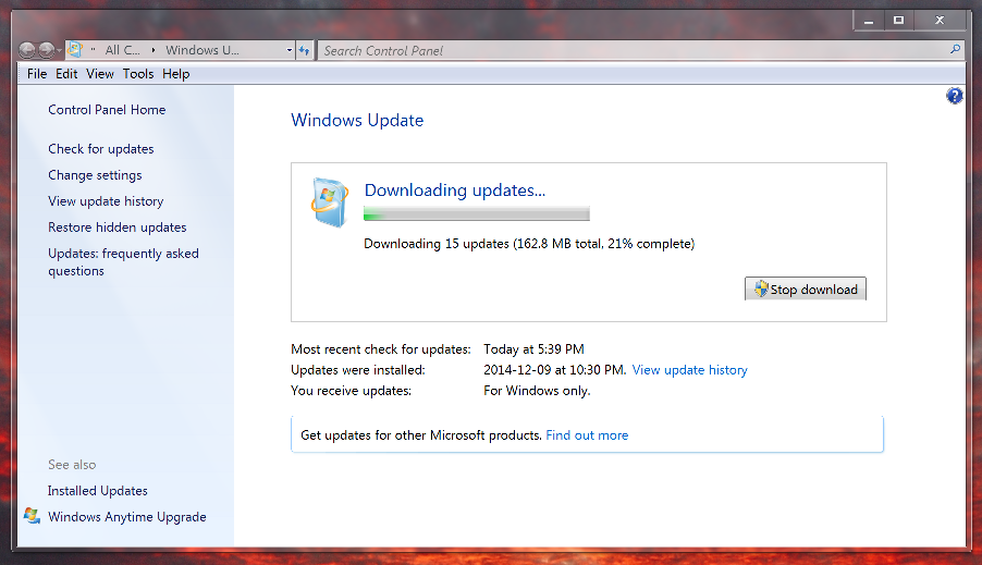 Microsoft Windows download updates
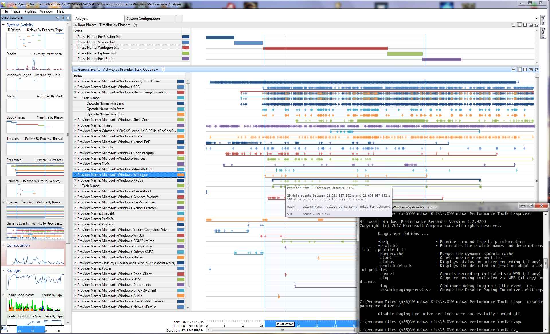 Windows boot performance analysis with wpr and other guff